
A one-sentence overview of the poster concept
A large-format poster is a big piece of paper or image on a wall-mounted monitor featuring a short title, an introduction to your burning question, an overview of your novel experimental approach, your amazing results in graphical form, some insightful discussion of aforementioned results, a listing of previously published articles that are important to your research, and some brief acknowledgement of the tremendous assistance and financial support conned from others — if all text is kept to a minimum (500-1000 words), a person could fully read your poster in 5-10 minutes.
Downloadable templates
Below are templates that can be used to make a meeting poster. Just download, adjust the dimensions (if you need to), and start typing. You can, of course, also change background color, text box color, font, etc. The templates are just starting points that can save you a few hours of fussing over the basics.
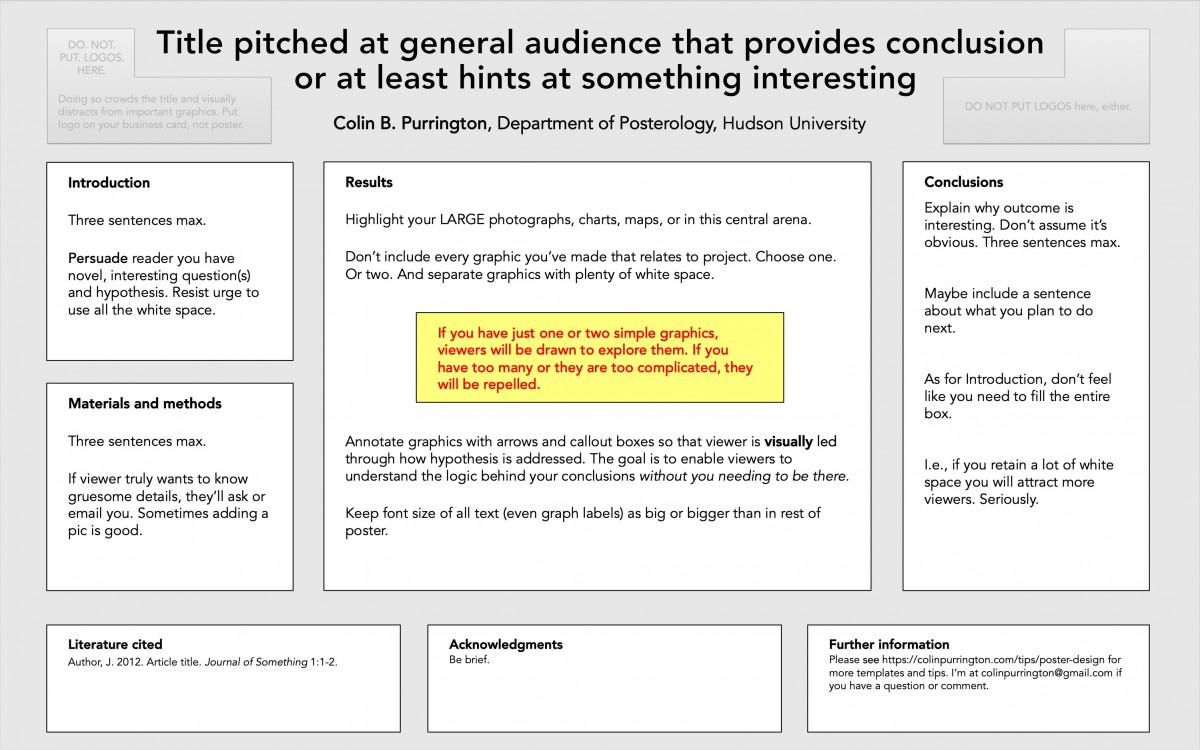
1. Horizontal template with results arena
This layout gives a lot of central, visible space to the results and demotes less important sections (Literature cited, Acknowledgements, Further information) to the bottom portion of the poster. Download (PPT file).
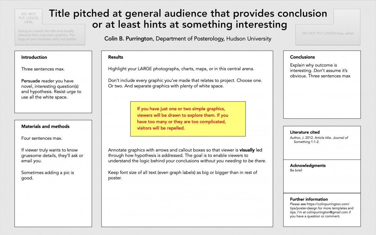
2. Horizontal template with big central column
If you prefer a more traditional layout (just columns) but still like the big central area for results, use this Powerpoint file (or emulate the design).
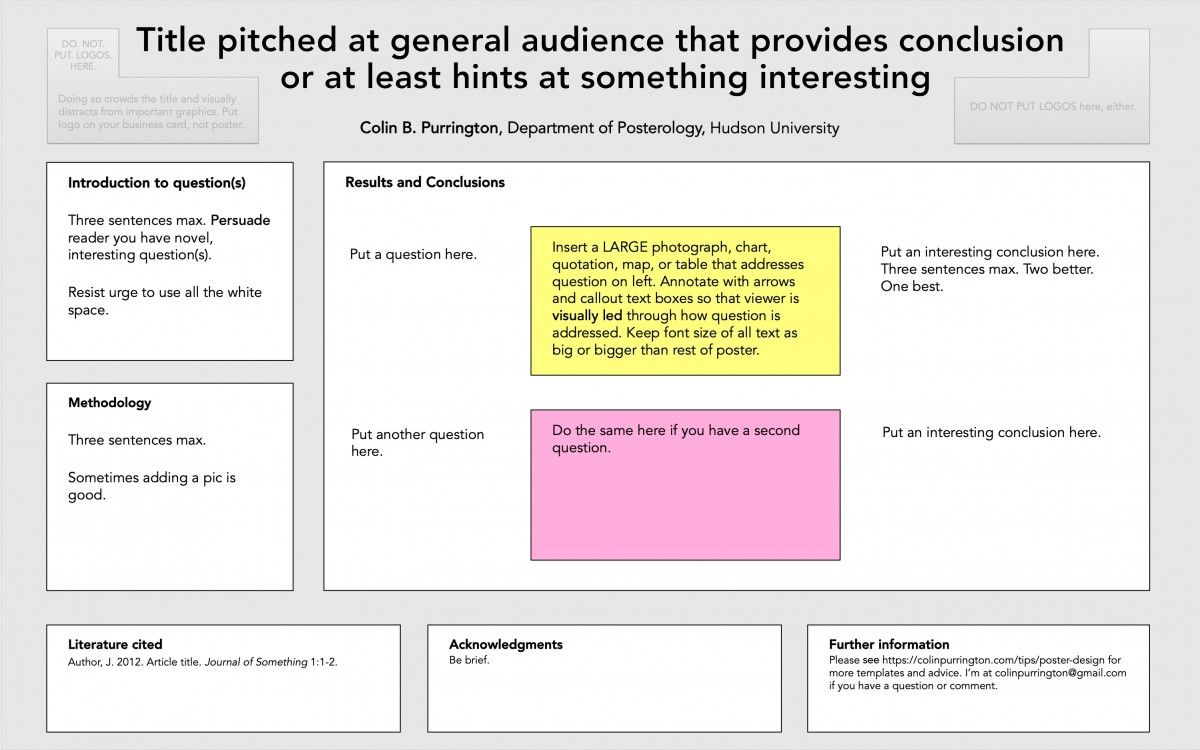
3. Horizontal template for humanities
This template (PPT) is just a modification to illustrate that you can rename your sections to fit your discipline and tastes. I’ve tweaked it to address two questions but you can modify it however you want.
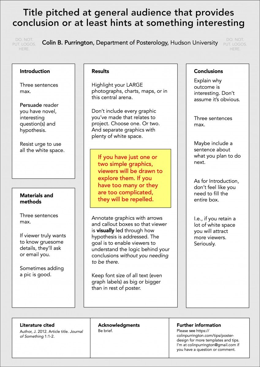
4. Portrait template
I hate portrait layout for posters but if you’re forced to use one, here’s a template (PPT). I’ve opted for a larger central column because your results are likely to contain charts or tables, and those don’t look good when overly shrunken.
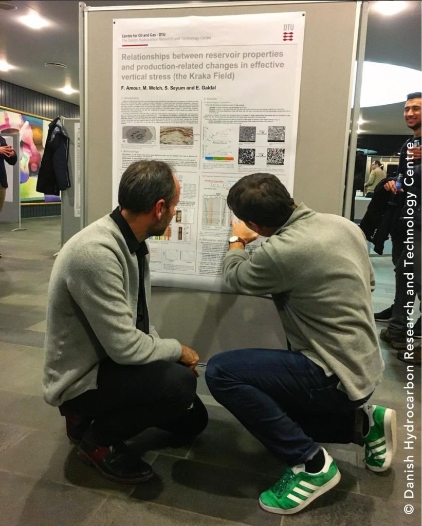
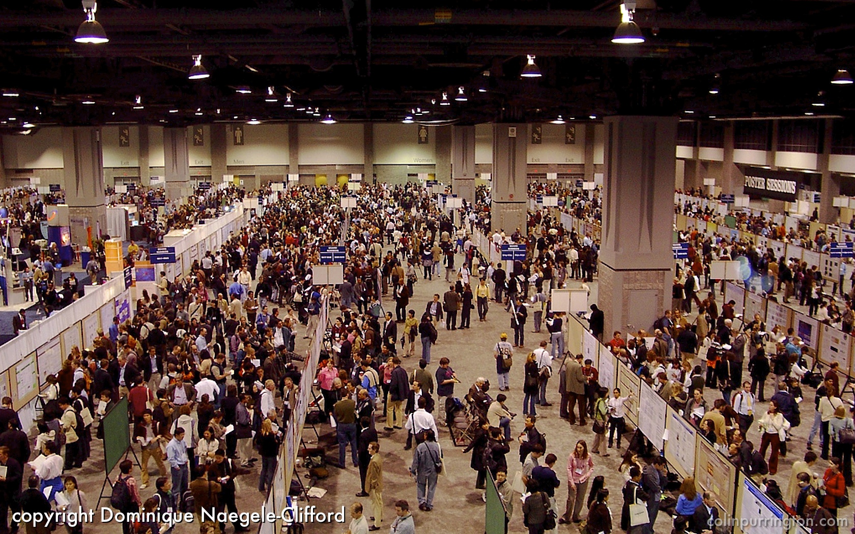
The photograph below illustrates why portrait layout is often bad for large-formate posters: a big chunk of the poster real estate is below a viewer’s field of vision so you need to stoop to fully read. If you are in charge of a poster session, please read my plea about this problem.
What to put in each section
Below are some rough guidelines on what to include in each section of a scientific poster and how to pitch that content. The word-count guesses are for a poster that is approximately 3 x 4′, so adjust accordingly if your poster is a different size. Names of the section headings are somewhat flexible, too, especially if you’re not crafting a science poster.
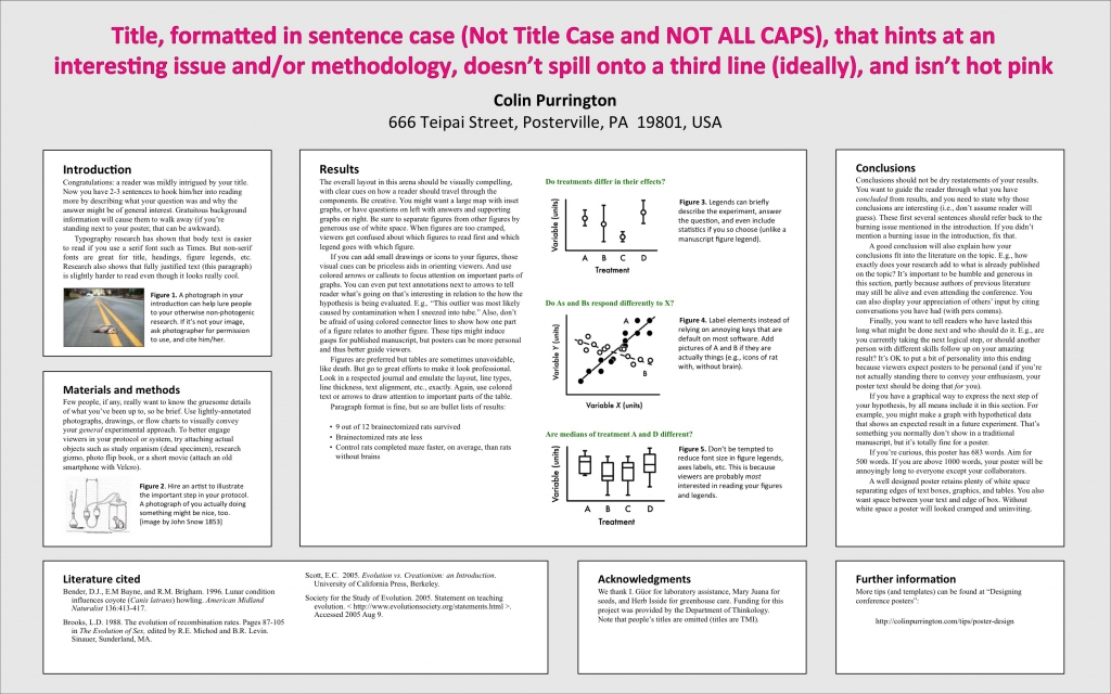
Title
Should briefly convey the interesting issue, the general experimental approach, and the system (e.g., organism); needs to be catchy in order to reel in passersby who are trying to avoid boring interactions, a real danger at conferences just like in the real world. [approximately 1-2 lines]
Abstract
Do not include an abstract on a poster (a poster is an abstract of your research, so having two summaries is a waste of valuable poster space). Some meetings require an abstract, of course, and if that’s the case be as brief as possible. But if you can get away with it, just omit the section —there are rarely poster police at conferences, and they’re not going to tase you if your poster lacks an abstract.
Introduction
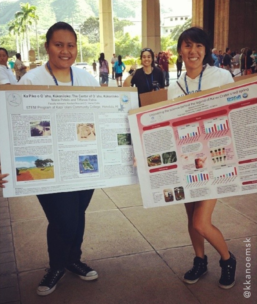
Write this section to target an intelligent person who is not in your field. Assume they don’t know your study organism at all and assume they are predisposed to find your topic unimportant. E.g., if you’re an astronomer, imagine a visitor who has a degree in biology or mathematics. Quickly (first sentence or two) get your viewer interested in the issue or question that drove you to take up the project in the first place. Use the absolute minimum of background information, definitions, and acronyms (all of which are boring). Place your issue in the context of published, primary literature. Pitch an interesting, novel hypothesis, then describe (briefly) the experimental approach that can test your hypothesis. Please note that “X has never been studied before” or “my mentor gave me this project” are lame reasons for doing something, even if true. Also note: unlike a manuscript for a journal, the introduction of a poster is a wonderful place to display a photograph or illustration that visually communicates some aspect of your research question. A nice image can draw people in even if you look boring or have a boring poster title. Keep length to approximately 200 words.
Materials and methods
Briefly describe experimental equipment and procedure, but not with the detail used for a manuscript. Use figures and flow charts to illustrate experimental design if possible. Include a photograph or labeled drawing of organism or setup. Mention statistical analyses that were used and how they allowed you to address hypothesis. Keep length to approximately 200 words.
Results
First, mention whether your experiment procedure actually worked (e.g., “90% of the birds survived the brainectomy”). In same paragraph, briefly describe qualitative and descriptive results (e.g., “surviving birds appeared to be lethargic and had difficulty locating seeds”) to give a more personal tone to your poster. In second paragraph, begin presentation of data analysis that more specifically addresses your hypothesis. Refer to supporting charts or images. Provide engaging figure legends that could stand on their own (i.e., could convey some point to reader if viewer skipped all other sections, which they will do). Opt for figures over tables whenever possible. This is always the largest section (except if you have no data). Keep length to approximately 200 words (not counting figure legends).
Conclusions
Remind the reader, without sounding like you are reminding the reader, of the major result and quickly state whether your hypothesis was supported. Try to convince the visitor why the outcome is interesting (assume they’ve skipped the Introduction). State the relevance of your findings to other published work. Add relevance to real organisms in the real world. Add sentence on future directions of research. Keep length to approximately 200 words.
Literature cited
Follow format described by your main society exactly. Grammar and typography police at conferences will find even minor infractions.
Acknowledgments
Thank individuals for specific contributions (equipment donation, statistical advice, laboratory assistance, comments on earlier versions of the poster). Mention who has provided funding. Do not list people’s titles (e.g., write Colin Purrington not Dr Purrington). Also include in this section disclosures for any conflicts of interest and conflicts of commitment (more info). If you have a lot of conflicts, put them all in a Conflicts section. Keep length to approximately 40 words.
Further information
If you haven’t botched the content and tone, some visitors will want to know more about your research, so provide your e-mail address, your web site address, or perhaps a URL where they can download a PDF version of the poster or relevant data. If you provide a URL, format it so it’s not blued or underlined. Full disclosure: I made up this section, so if your mentor thinks it’s silly, that’s why. Keep length to approximately 20 words.
DOs and DON’Ts
Below are some tips to avoid producing a terrible poster. Please see this post for an example of a terrible poster.
- The number one mistake is to make a poster too wordy. Aim for 1000 words or less. That might mean 700 words in paragraph form (body text), plus 300 words in the legends of all your figures and tables. Below is an example poster that has almost 2000 words, 1000 too many.
- The second-most common mistake is related to the first: a failure to maintain a pleasing amount of white space around text boxes and figures. A cramped poster is hard to read, and the brain simply cannot effectively process the information provided, regardless of how amazing it is.
- Avoid titles with colons if you can: they are overused. If you absolutely must have a coloned title, just be sure it doesn’t force you to spill onto a third line.
- Format the title in sentence case (#1, below) so that capitalization and italicization are preserved in trade names, Latin binomials, gene names, allele names, etc. For example, title case (#2 below) and all caps (#3 below) obscure such information.
- Effect of ken and barbie knockouts on sexual preference in Drosophila melanogaster
- Effect of Ken and Barbie Knockouts on Sexual Preference in Drosophila Melanogaster
- EFFECT OF KEN AND BARBIE KNOCKOUTS ON SEXUAL PREFERENCE IN DROSOPHILA MELANOGASTER
- Use a non-serif font (e.g., Helvetica) for title and headings and a serif font (e.g., Palatino) for body text. Serif-style fonts are much easier to read at smaller font sizes (that’s why novels are rarely set with Helvetica and the like).
- Do not add bullets to section headings. The use of a bolded, larger font is sufficient for demarcating sections.
- The width of text boxes should be approximately 45-65 characters. Lines that are shorter or longer are harder to read quickly.
- Don’t vary the width of text boxes (it’s visually distracting).
- Whenever possible, use lists of sentences rather than blocks of text.
- Use italics instead of underlining. Underlining draws too much attention to a word.
- When using acronyms and numbers (e.g., ATP, 42) within the body of text, scale down the font size by a couple of points so that their sizes don’t overpower the lowercase text. Use of “small caps” will sometimes do the trick, but this effect varies with different fonts and with different software.
- Set line spacing manually to make sure spacing is uniform. Doing this is critical if you have used super- or sub-scripted text. If you don’t, only some lines will have extra space, and that would be visually distracting.
- Do not trust the tab button to insert the correct amount of space when you are indenting a paragraph (the default is usually too big). Set the tab amount manually, with the ruler feature. And never, ever use spaces to create a tab-like space (it just doesn’t work).
- When you have quotations, make sure your software hasn’t used the “double prime” glyph instead of quotation marks. Double primes are the thingies used for inches (e.g., 5′ 11″), and mathematical formulas/formulae.
- Correct any errors in spacing wit hin and between words, especially before and after italicized text. (See how annoying that is?!)
- Use only a single space between sentences. The double-space convention was needed for typewriters so insisting on two spaces marks you as old person. Use the Search/Replace feature to globally replace all double spaces with single spaces (and to locate locations where too many spaces occur between words).
- Avoid dark backgrounds for text boxes. Dark text on white is the easiest for most people to read. Also, dark backgrounds make designing graphics much harder. It’s better to just use a white background. And you save on ink, too.
- Avoid color combinations that create problems for those with color-deficient alleles. Approximately 8% of males and 0.5% of females have some degree of color-vision deficiency (example). To test whether you’ve made a terrible mistake in color choice, you can run a JPG of your poster through Coblis, or use the built-in simulator in Photoshop. In general, avoid using red and green together, and opt to use symbols and line patterns (e.g., dashed vs solid) instead of colors for graph elements.
- Similarly, if you have a color sensitivity mutation and don’t know it, you might choose colors that are inadvertently confusing or clashing. Get yourself tested, especially if you’re a white male.
- Complete the entire poster on a single platform. Switching from PC to Mac or Mac to PC invites disaster, sometimes in the form of lost image files or garbled graph axes. Even if you are lucky enough to transfer content across platforms, switching in this way often creates printing problems in the future.
- Give your graphs titles or informative phrases. You wouldn’t do this in a manuscript for a journal, but for posters you want to guide the visitor as much as possible.
- If you can add miniature illustrations to any of your graphs, do it. Visual additions help attract and inform viewers much more effectively than text alone. Tables benefit from this trick as well.
- Choose the right graph. Please see “Watch your figures” for help choosing among bar graph, line graph, etc.
- Most graphing applications automatically give your graph an extremely annoying key that you should immediately delete. Just directly label the different graph elements with the text tool.
- Acronyms and other shorthands for genotypes, strains, and the like are terrible for communicating with people outside of your laboratory. Use general, descriptive terms, even if they require more space, which they do.
- Y-axis labels aligned horizontally are much, much easier to read, and should be used whenever space allows.
- Format axis labels in sentence case (Not in Title Case and NOT IN ALL CAPS). People process sentence-case text faster.
- Never give your graphs colored backgrounds, grid lines, or boxes. If your graphing program gives them to you automatically, get rid of them. (If you are friends with any of the programmers who make software that has such settings as defaults, please plead with them to revisit that decision.)
- Never display two-dimensional data in 3-D. Three-dimensional graphs look adorable but obscure true difference among bar heights.
- Make sure that details on graphs and photographs can be comfortably viewed from 6 feet away. A common mistake is to assume that axes labels, figure legends, and numbers on axes are somehow exempt from font-size guidelines. The truth is that the majority of viewers want to read only your figures.
- If you include photographs, add a thin gray or black border to make them stand out against background color.
- Provide the source of any image that is not yours. And only uses images that are in the public domain. When in doubt, ask the author/photographer/illustrator for permission. Or buy it. Please see, “Adding photo credits to talk slides.”
- Use web graphics with caution. You need something with high-enough resolution so that it doesn’t look pixelated (fuzzy) when printed. FYI, photographs imported from TIFFs often look better than JPEGs because the latter are often compressed too much (or too many times). Gruesome details if you’re interested.
- If you can’t find the perfect illustration or photograph for your poster, get one made. A good image can be used in multiple posters, future talks, and even in manuscripts. There are lots of illustrators and photographers out there, and they are starving. Give them a call.
- Don’t clutter the top of your poster with logos. If you are required by your mentor to include logos on your poster, put them on the bottom of the poster and make them small. Here is an example image of a poster with logos at the top if you’d like see why it’s a graphical fail.
- Format your Literature cited contents carefully. Even small mistakes will mark you as incapable of grasping the importance of details. When asking somebody to proof your poster, specifically ask them to be critical of your citation format. Ask several people, too: no one person is going to catch all your errors. Keep the font size the same as the size in other sections.
- Write “data are,” not “data is.” “Data” is a plural noun while “datum” is the singular. Although it’s true that almost all non-scientists say “data is” when speaking, you should protect yourself from the scorn of grammar prudes at conferences. There are a lot of Type A people in science.
- If you don’t know the difference between “effect” and “affect,” it’s probably best to avoid those words. The Oatmeal’s “10 words you need to stop misspelling” explains the difference nicely.
- If you use “woman” as an attributive noun (e.g., “woman participant”), be consistent and use “man” in the same way (e.g., “man participant”). If either sounds awkward, revert to using adjectives (female, male), which work really well. Here’s the same advice from a woman in case you have discounted my opinion because I’m male.
- Don’t plagiarize. If this is not obvious, please see my page on the topic.
How to make your poster more engaging
Your poster is yours, so you should feel free to add objects to increase the effectiveness of your message. Doing so will dramatically increase the number of people visiting and remembering you and your poster.
1. Add hidden panels
If you have information that only some viewers might find interesting, use a hidden panel approach. Just print your interesting extras onto your poster, then cover the area with a hinged piece of poster board onto which you have glued something else. Zoos and museums do this a lot.
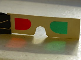
2. Add 3D images
If you have three dimensional data or complex molecular structures (examples; more examples), make 3D images. There are software programs that can generate stereoscopic images that are viewable with cheap 3-D glasses. Here are directions on making your own stereoscopic setup for about $19.98 (before taxes) using Legos and two novelty key-chain cameras. Have a pouch near the figure so that viewers can help themselves to glasses even when you have abandoned your poster. Attach glasses with string if you think somebody will walk off with them.
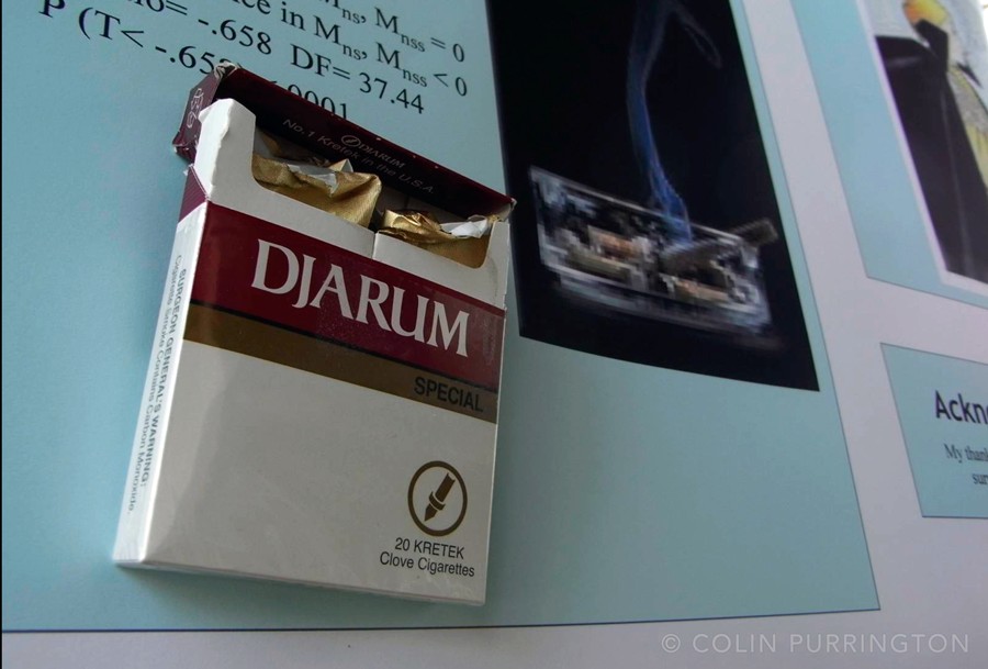
3. Add objects
If your topic is related to a thing or object, attach it. E.g., if you study sexual dimorphism in freakishly large beetles, glue the beetles onto the poster so people can appreciate them. It’s so much better than a photograph. If your thing is fragile, just put it into clear protective container and then attach the container. Use 3M removable tape if you want to minimize damage to underlying poster paper. Neodymium magnets are even slicker — just attach a magnet to your thing and affix a second magnet on the poster. Note that researchers of large things can always use miniaturized version made by a 3D printer (example). Attaching an object will increase visitor traffic by at least 20% (I’m making that up, but I’m sure it’s measurable).
4. Add doodles
Use removable tape to add a transparency sheet over a graph or photograph if you want to make non-permanent doodles with Dry-Erase markers. You can then doodle on critical parts of your poster, then erase.
5. Add slideshows and movies
If you wish to show movies or photographs, attach an iPad (below; another example). Here’s a video showing how to attach. If the movies and photographs look OK on smaller screens, use an old iPod or iPhone. You can also buy cheap digital photo frames at Targét. Note: provide headphones if audio is banned in session room (common). And if your media presentation is critical to the poster, put it online and then provide the QR code (for URL) on the spot underneath the iPad so that viewers can still see the movie even when you remove the iPad (so people don’t steal it when you’re away from your poster).
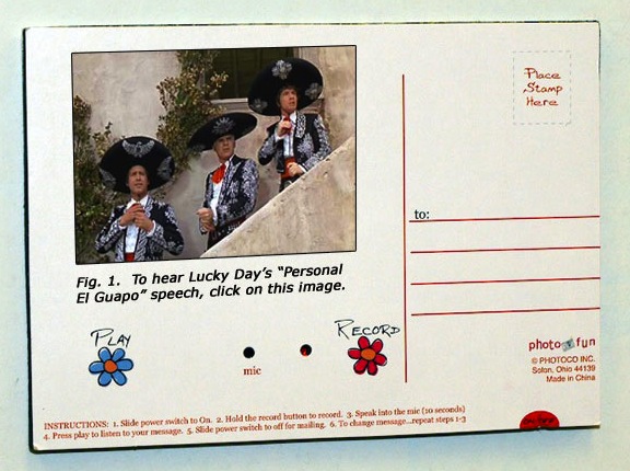
6. Add sound
If your topic is related to sound, attach a sound device that contains your sound (bird calls, engine rattle, etc.). A cheap “sound postcard” will often do the trick if you don’t want to risk your iPad. Just fill the picture frame with an illustration of the sound-generating organ or machine, and indicate where on the photograph the viewer should press to activate the sound.
7. Add virtual reality content
Add virtual-reality content (and VR goggles) if you need a way to enhance the poster-viewing experience in some way.
8. Add odors
If your topic is related to olfaction, try to get the odor onto your poster somehow. Microencapsulation is one way to make scratch-n-sniff areas, but if you work on a common odor there might be a scented ink that you can just buy. E.g., you might go for the smell of fresh cut grass if your poster is on effects of grazing. Gimmicky, but then you’d be famous. You can also buy odor sample bags to trap smells for later use (just attach them to your poster with instructions on how to extract a whiff).
Printing
Before you print a poster, print to a PDF first and confirm — at 100% magnification — that colors, fonts, and images look perfect. If you’ve never printed to a PDF before, it’s easy: on Windows machines, select, “Save As”, and on Macs, “Print To.” If the PDF looks awful, go back and fix your source file. One trick is to upload the PDF to http://pdf-analyser.edpsciences.org/, which will give you a listing of the resolutions of all images contained, plus will flag any fonts you’ve used but weren’t embedded in the PDF. If you own Adobe Acrobat Pro, you can get the same information by running a preflight diagnostic.
Once you have a PDF that you’re pleased with, send it to your campus poster printer, a local media business (Office Max, Staples, Kinko’s, etc.), or to a poster printing service that prints academic posters. If you opt for an online service, they’ll mail it to you (in a tube), even to your meeting location if you so desire. I’ve use PhD Posters in the past because their locations are run by people with science PhDs who value good design and know about academic conferences (plus they haven’t plagiarized my site like other companies). In many cases, conference organizers have arrangements with online poster printers that offer a discount, so check with the people in charge. Ideally, do all the above in time that you can re-print if you discover a problem. You might have made a $100 mistake, but if you’re trying to impress people, and you probably are, it might be worth the do-over.
These days, there are lots of options on paper thickness and gloss, plus even the option to print on various types of fabric that can be folded. One huge advantage of fabric posters is that you can store the poster in your briefcase/backpack, and thus minimize the chance you’ll inadvertently leave the poster behind at the airport (when your poster is in tube, this happens). Another huge advantage of cloth posters is that when you are done presenting you can make geeky clothes.
Of course, many conferences these days feature posters on monitors. But you should also print your poster so that you have something to hang in your hallway when you return.
Note that if you receive your poster and the images look pixelated or the colors displease you, just print out high-resolution replacements and attach them with tape to cover the bad versions.
How to present a poster
To see people presenting posters, there are thousands of YouTube videos. Tips below will help you get the most out of the experience.
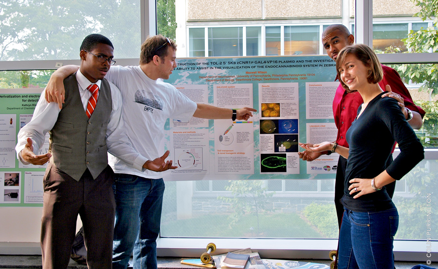
- At most meetings you’ll be required to stand next to your poster and walk a visitor through it. But you should have designed it so that it’s understandable without you around.
- If your conference promotes a meeting hashtag (e.g., #geekfest19), broadcast a short title and your poster’s time and location on Twitter. Here are some examples of people trying to drum up an audience in advance. If your society hasn’t advertised the official hashtag at least a year in advance, nudge them to get on board with modernity.
- Attach a sketch of your research topic to yourself at the start of the meeting. Or a miniature version of your actual poster. 4×6″ sticker label paper is ideal. Add text like, “Lincoln Conference Room, Fri @ 7pm”, so people know where/when to find you. You can also opt to make the drawing on a card that matches the size of your meeting ID, and then attach with tape on back.
- Add your email address and phone number onto the back of your meeting registration ID. When people ask for your contact information, just flip it around and they can copy what they need.
- Do not refer to notes when explaining your poster.
- When presenting your poster, use your fingers to point out specific parts of your poster.
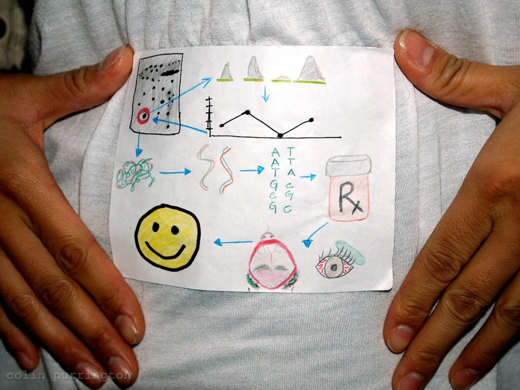
- A typical poster visitor appreciates a 2-sentence overview of why your research is interesting and relevant. Get them hooked on your question before explaining anything more about your poster. For example, you might point to the illustration of the submerged hamster in your “Materials and methods” and say, “I was interested in whether hamsters could evolve gills when subjected to repeated dunkings, which would be adaptive if the ice caps melt away.” Then point to the graph in Results section and say, “I found that hamsters didn’t evolve gills, but instead drowned.” Keep it general, and make it clear to the visitor why you find the topic interesting.
- Avoid vagueness such as “this figure shows our main result.” Say something concrete, like, “We found that brainectomized rats finished the maze more slowly, as you can see from this graph that plots time…”
- If more viewers arrive halfway into your spiel, finish the tour for the earlier arrivals first. That’s unless the new arrivals are super important, and the first crowd just a bunch of worthless groupies.
- When in doubt about how to act at your poster, imagine that a viewer will be considering your application for a job ten years into the future, or will be considering your graduate school application next week. This is pretty much how it all happens.
- Attach a few business cards to your poster. Even if you are an academic and think owning a business card destroys your soul. If you want to stay informal, just order yourself a stack of cards that feature photographs of your research organism (or star system, or whatever you work on). I’m fond of MOO (see my cards).
- If you must leave your poster for a bit, attach a note alerting any viewers to your expected time of return or telling them where you can be found. Put your phone number on the note. E.g., “Hey, this is crazy, but if you want to chat about this poster, text me at 800-867-5309.”
- If you’re assigned to a dark corner in the poster session room, buy a cheap flashlight and stick it on a leash for visitors. Or, better, attach a clip-on, battery-powered lamp.
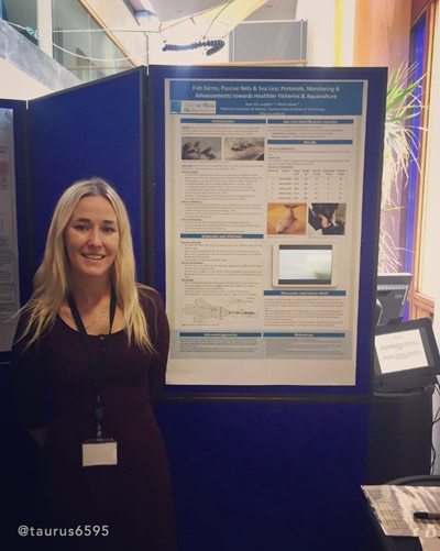
- Attach a photograph of yourself near or on your poster so that people can find you more easily.
- Have on hand, but don’t aggressively peddle, manuscripts and reprints of your work. If you have space on the mounting board, just pin them up for the taking.
- Make shrunken versions of your poster as handouts. If you have resisted the urge to shrink your font size, the text will still be legible.
- If you have unpublished research, or research that might be deemed offensive to non-scientists, attach a “Please do not photograph” note to your poster.
- Keep a black pen and correction fluid in your pocket in case a viewer discovers an embarrassing tybo.
- If you are obsessive compulsive and have a large wardrobe, try to choose your clothes to match your poster color (more people will visit). If you’re color blind or fashion-impaired, please ask somebody for help.

- To lure viewers, attach a clear plastic cup full of candy to your poster along with a note saying, “please help yourself.” Stand off to the side of your poster, then swoop back in when victims take the bait.
- If you’re the plan-ahead type, make a JPG of your poster (or research organism) and order yourself a t-shirt to wear at conference. It would be funny, plus would attract people to your poster who might not otherwise care at all. When everyone starts doing this it won’t be as funny, so act now.
- If you’re outgoing and unhappy with your assigned poster location, go mobile. Just attach some string onto the top to convert your poster into something wearable then go find an audience. You can also order a sandwich board.
- Thank your viewers for visiting. If they have stayed more than 4 minutes, you have succeeded. If they say, “This is really interesting — I’ll definitely come back later,” you have failed.
Motivational advice
The best general advice I can give a first-time poster constructor is to describe the circumstances in which a poster will eventually be viewed: a hot, loud, congested room with really bad lighting. And meeting organizers will invariably situate your poster next to something more catchy such as “Teaching house cats to perform cold fusion.” Your poster needs to be interesting and visually slick if you hope to attract viewers.
If you’re crafty, a handmade poster is far superior to anything that you could make with a poster printer. Plus you’d be the highlight of a meeting. E.g., Jason McDermott’s poster.
Embrace the rough draft process
The most important part of producing a great poster is to embrace the rough draft process. You’ll want to get honest feedback from people in your laboratory and from smart strangers who might not really care about your topic. Perhaps the easiest way to get feedback is to print a miniature version of your poster on 8 1/2 x 11″ paper. If people can’t read the text (especially on the figures), that’s a sign that your font size is too small. Another way to get feedback is to use a projector to display your poster on a large screen or monitor, then ask people to verbally critique. You want an audience that can walk up to the screen like it’s a poster at a meeting.
Ideally, print a draft poster at least a month before the meeting and get people to critique your poster when you are not present. I.e., hang it in a hallway with a huge sign that pleads and begs for honest feedback about layout, word count, spelling, font, color, content, etc. Tell them to leave comments on Post-It notes (so provide these in container, with pens). And, again, don’t be present for this. If you are lurking like a proud parent, people will say, “Looks beautiful!” out of politeness and a desire to get away fast. If your hallway is populated with slackers, motivate them by providing food rewards in a box attached near poster. Attach sign to box: “Please tell me how to make my poster better. Mini candy bars are my pathetic thanks.”
Software recommendations
Although the vast majority conference posters on the planet are produced with Microsoft Powerpoint, you’ll end up with a better-looking poster if you use a page-layout application such as QuarkXPress, InDesign (great poster instructions), LaTeX (templates; instructions; example), or Scribus (instructions). These programs allow control of text wrapping around images, automatic text flow among associated text blocks, and much more. You can also make posters with graphics software such as Illustrator, CorelDRAW, Freehand, Omnigraffle, and Inkscape. I’ve also heard great things about Canva. There’s also PosterGenius for those who need a program that will make a lot of the design decisions for you.
Why give a poster instead of a talk
Although you could communicate research via a 15-minute talk at the same meeting, presenting a poster allows you to more personally interact with the people who are interested in your topic, and lets you reach people who might not be in your esoteric but no doubt fascinating sub-field. And, it turns out, posters sessions are not all about you: research has demonstrated that people who are standing are more engaged learners than people sitting in chairs (at talks). Posters are also handy because they can still be viewed even when you’re not present. And after the conference ends, you can hang the poster in the hallway of your department for people to admire. Finally, presenting a poster is especially recommended if you are bad at public speaking or can’t comfortably speak a particular language (the reason poster sessions were invented).
More information
If you want a shorter version of all these tips (likely), please see my poster that have poster tips — it’s printable and makes a great handouts if you’re a teacher.
My terrible poster example is here. I also have a page of tips for folks in charge of organizing a poster session.
COPYRIGHT 2019 COLIN PURRINGTON